Scaling Fivetran's Design System Across the Product

Strategic Challenge
Fivetran's lack of design cohesion was slowing teams down and creating inconsistent experiences.
We needed a unified system to accelerate delivery and raise the quality bar across the product.
My role
Led end-to-end design of the system while also delivering product work. Built all core components in Figma, created documentation, and partnered with a design systems engineer for implementation.
Key outcomes
- 10x increase in design system component usage in under a year
- 75% of teams using the system weekly, 100% each sprint
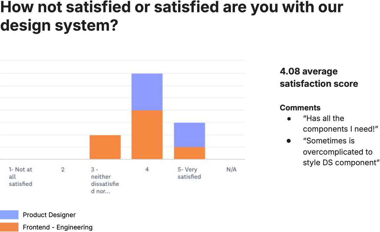
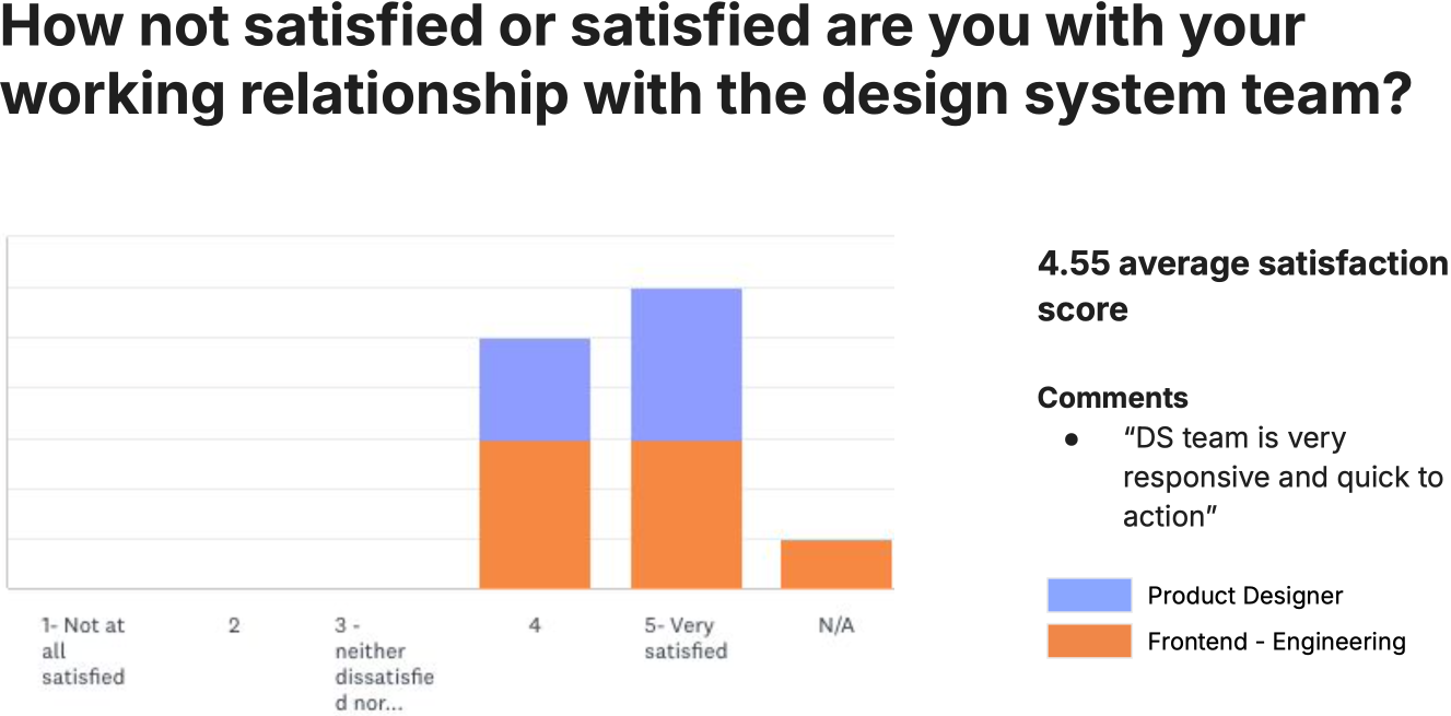
- 4.3+ satisfaction scores across design and engineering
Context
Fivetran's product was growing, but the front-end wasn't scaling with it. Teams designed and built independently, leading to inconsistent components, mismatched patterns, and duplicated effort. Even simple UI elements like buttons, tables, and inputs varied from team to team. Accessibility, visual clarity, and usability were often overlooked.
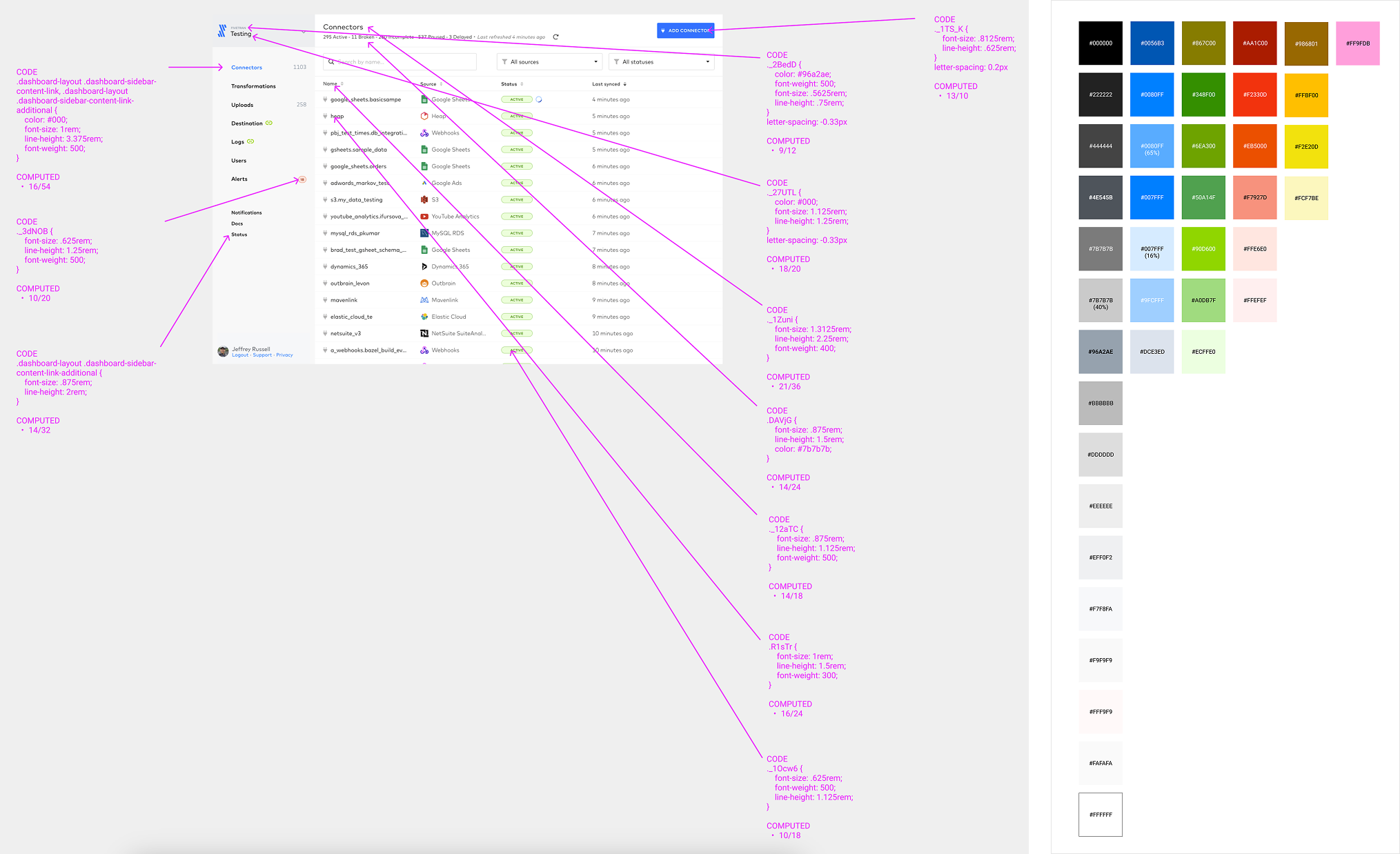
Before we could build a shared system, we needed to understand the problem. I led a comprehensive audit across the app, identifying visual inconsistencies, undocumented styles, and implementation gaps. We found over a dozen different font styles in a single view, and colors being used far outside our palette.
We needed a shared foundation: a design system that would drive consistency, speed up delivery, and support the company's broader goals around accessibility and theming.
Process
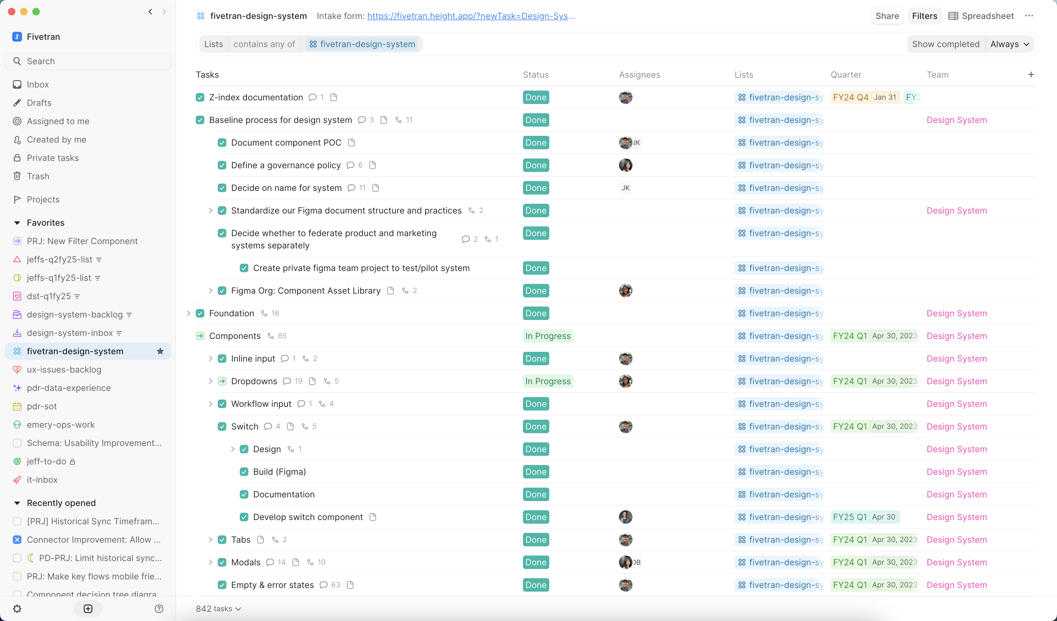
To build the system without pausing product work, I scoped out the initiative on our internal Height board, organizing it by component groupings and parallel design/engineering phases. I tracked progress, surfaced blockers, and made it easy for anyone on the team to see what was in flight.
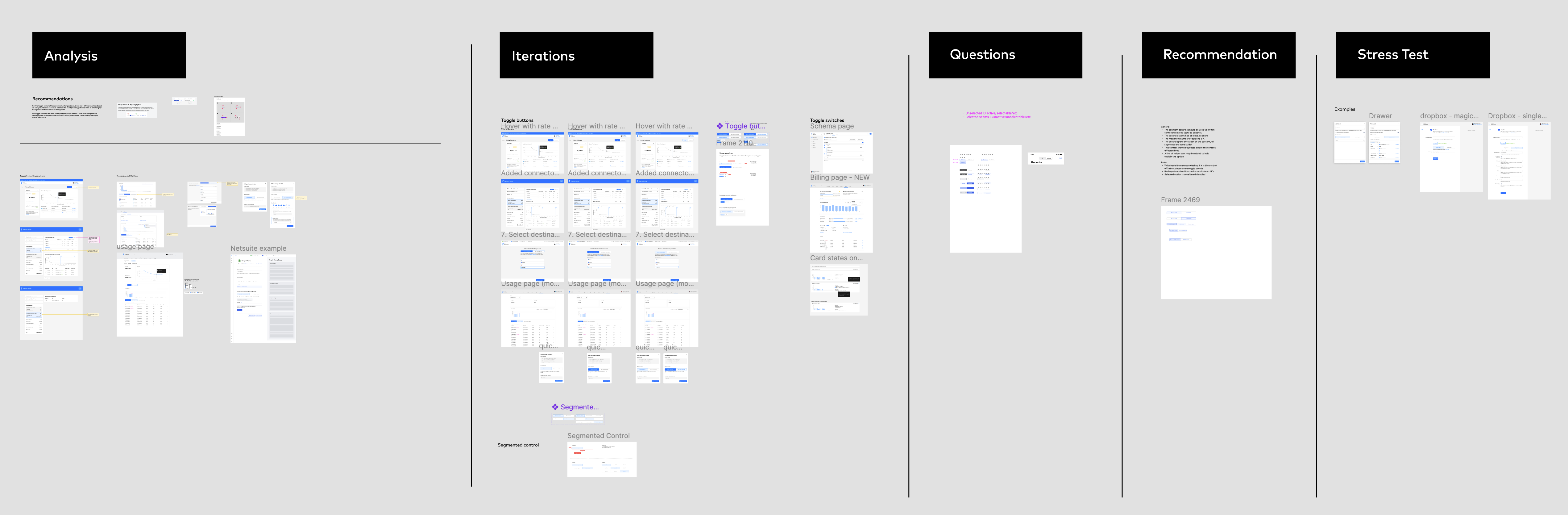
We started with an audit: inventorying every screen in the app to catalog inconsistencies in type, color, spacing, and layout. Each designer took ownership of specific components and patterns, contributing questions, comparative research, and design explorations in a shared Figma space. That work became the foundation for our alignment sessions.
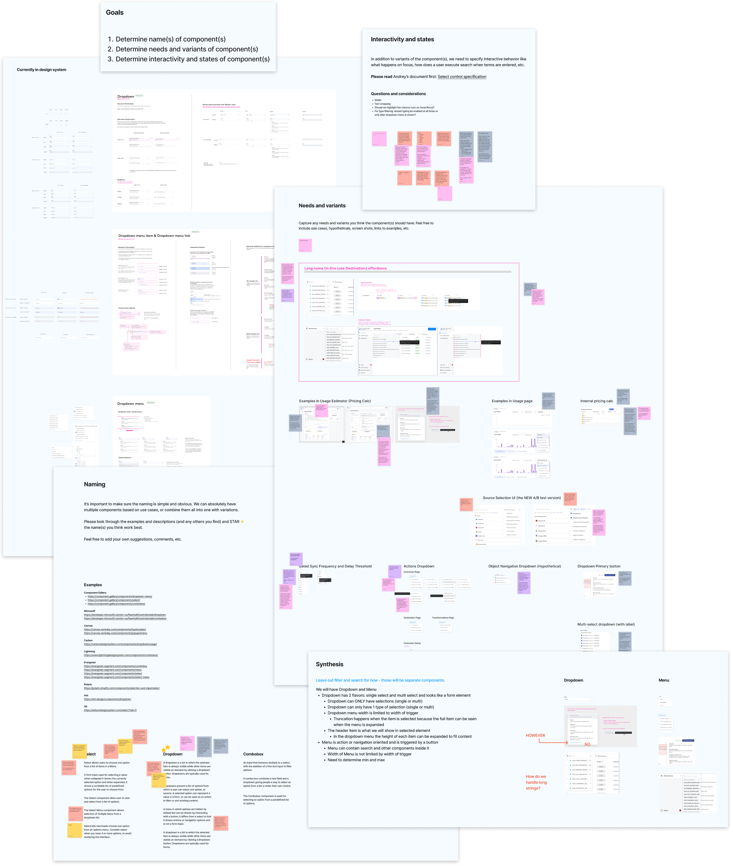
From there, I ran a series of workshops to define shared patterns. These sessions were structured but open-ended, giving space for discussion while driving toward concrete outcomes. We aligned on things like dropdown behaviors, empty states, form spacing, and interaction styles. These decisions would later be codified into the system.
Solution
To support a growing product and design team, we built a scalable design system with a clear architecture, an open contribution model, and consistent implementation across code and design.
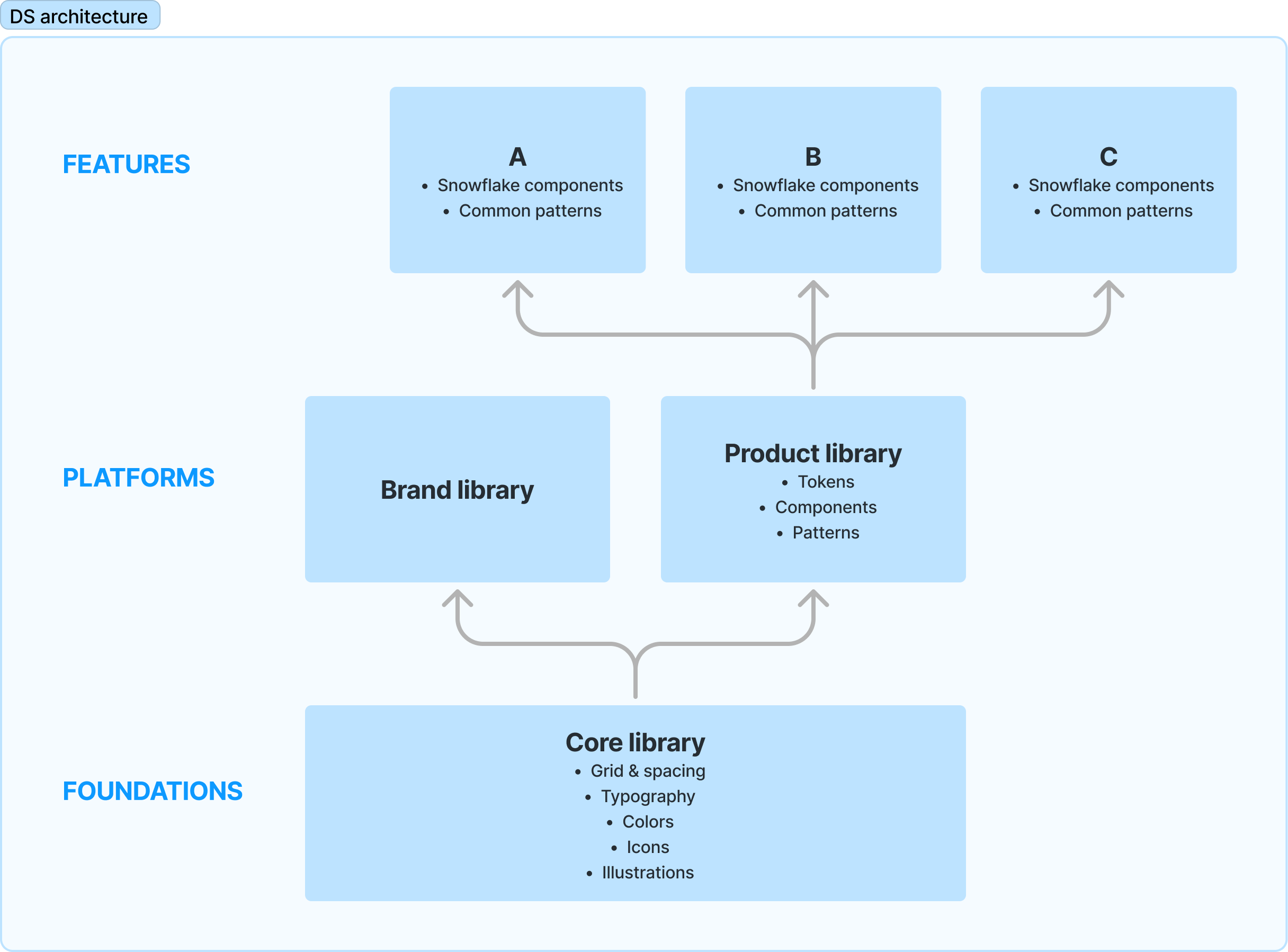
I started by defining a modular architecture: a core system of tokens and components that could be extended by product-specific libraries, feature-level components, and our brand layer. This structure gave us flexibility without compromising consistency.
To keep the system evolving, we created a clear contribution model. Designers and engineers could propose new components or improvements, with guidelines for how to scope, validate, and document their work. Ownership was distributed rather than centralized, which helped foster adoption and accountability.
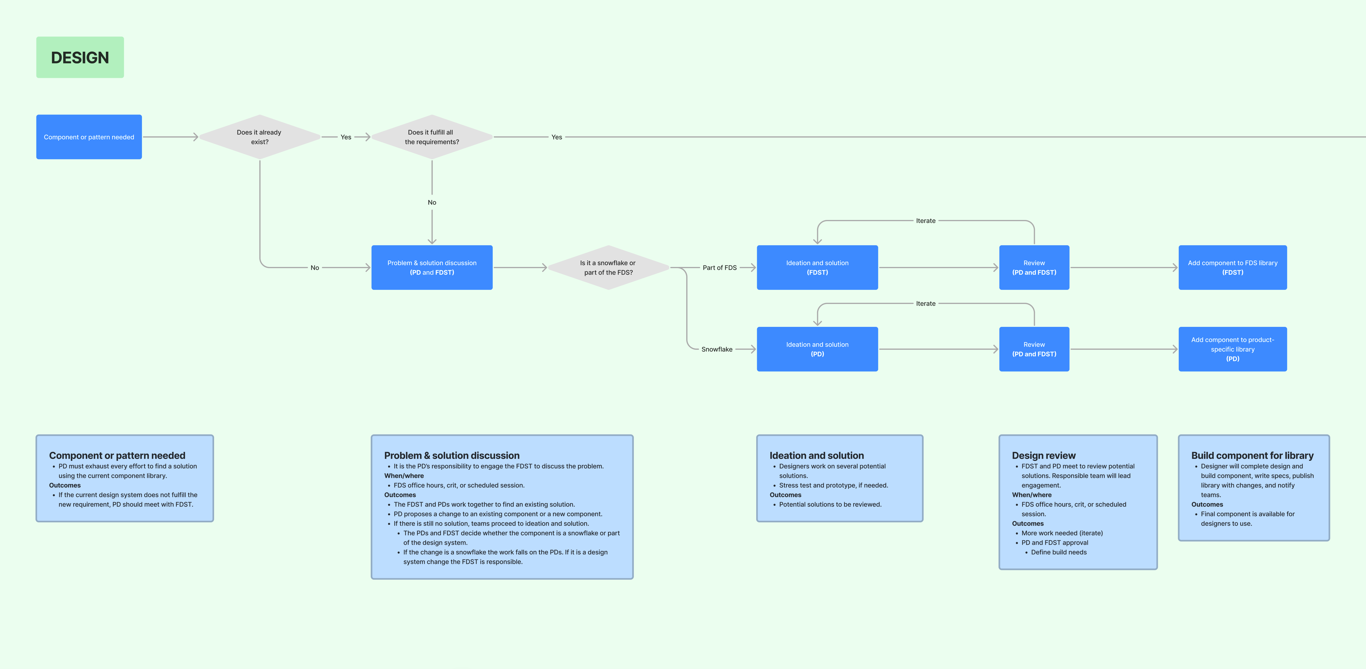
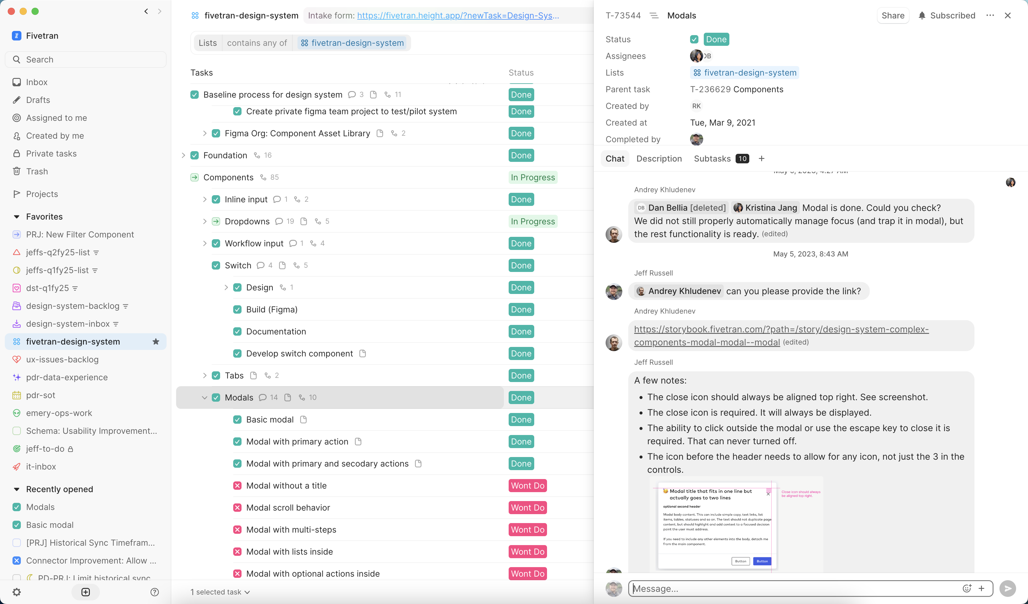
Every component went through a rigorous QA process that I created, tested across states and edge cases in Figma before implementation. I encouraged the team to submit bugs and inconsistencies either directly or through our structured Height ticket system, giving them a formal path to raise issues and suggest improvements.
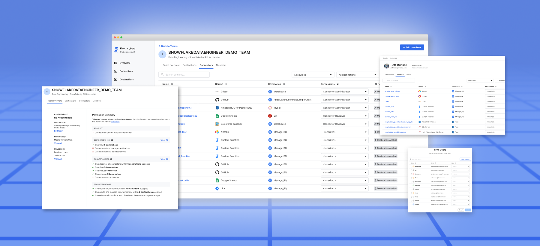
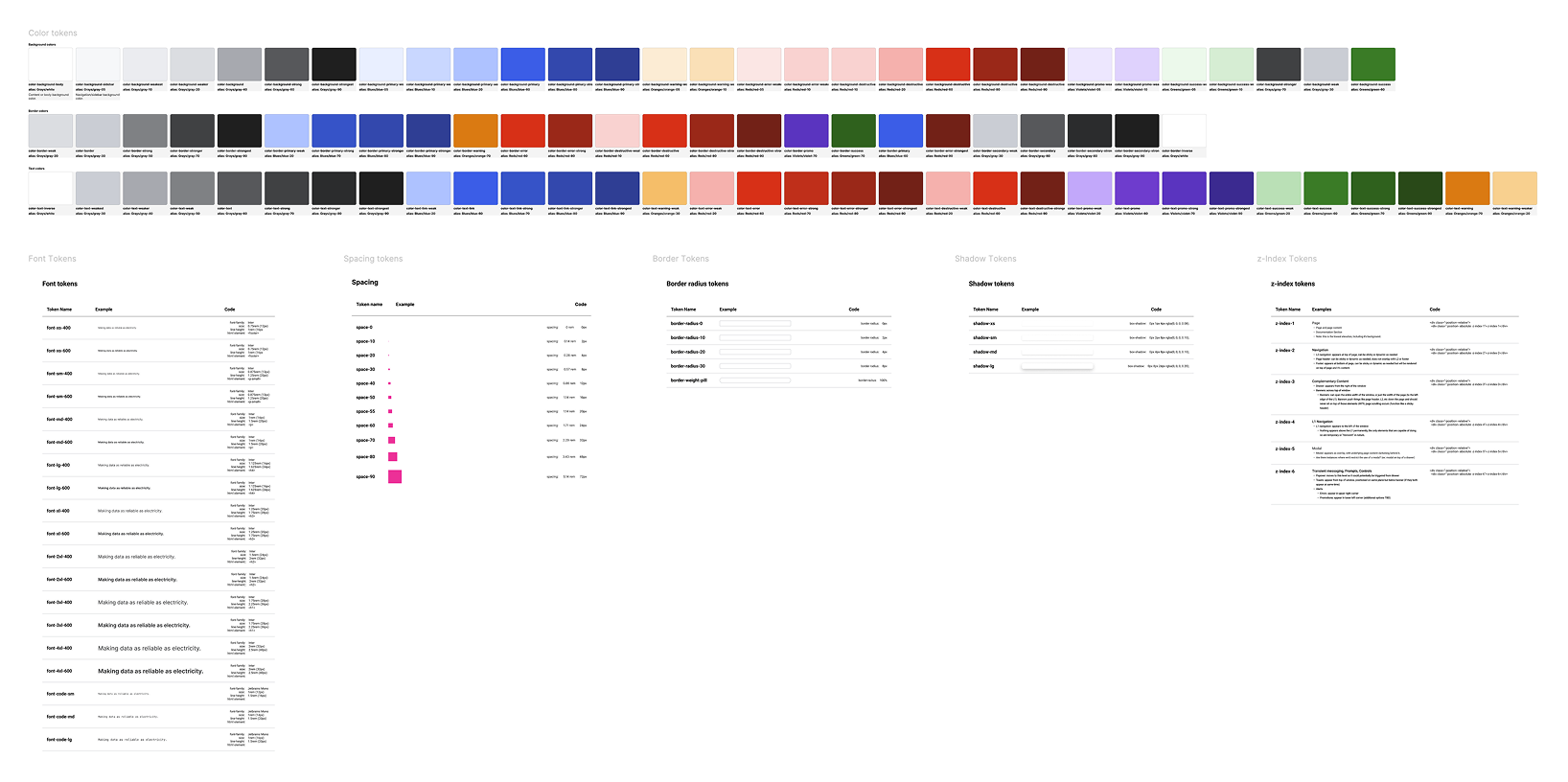
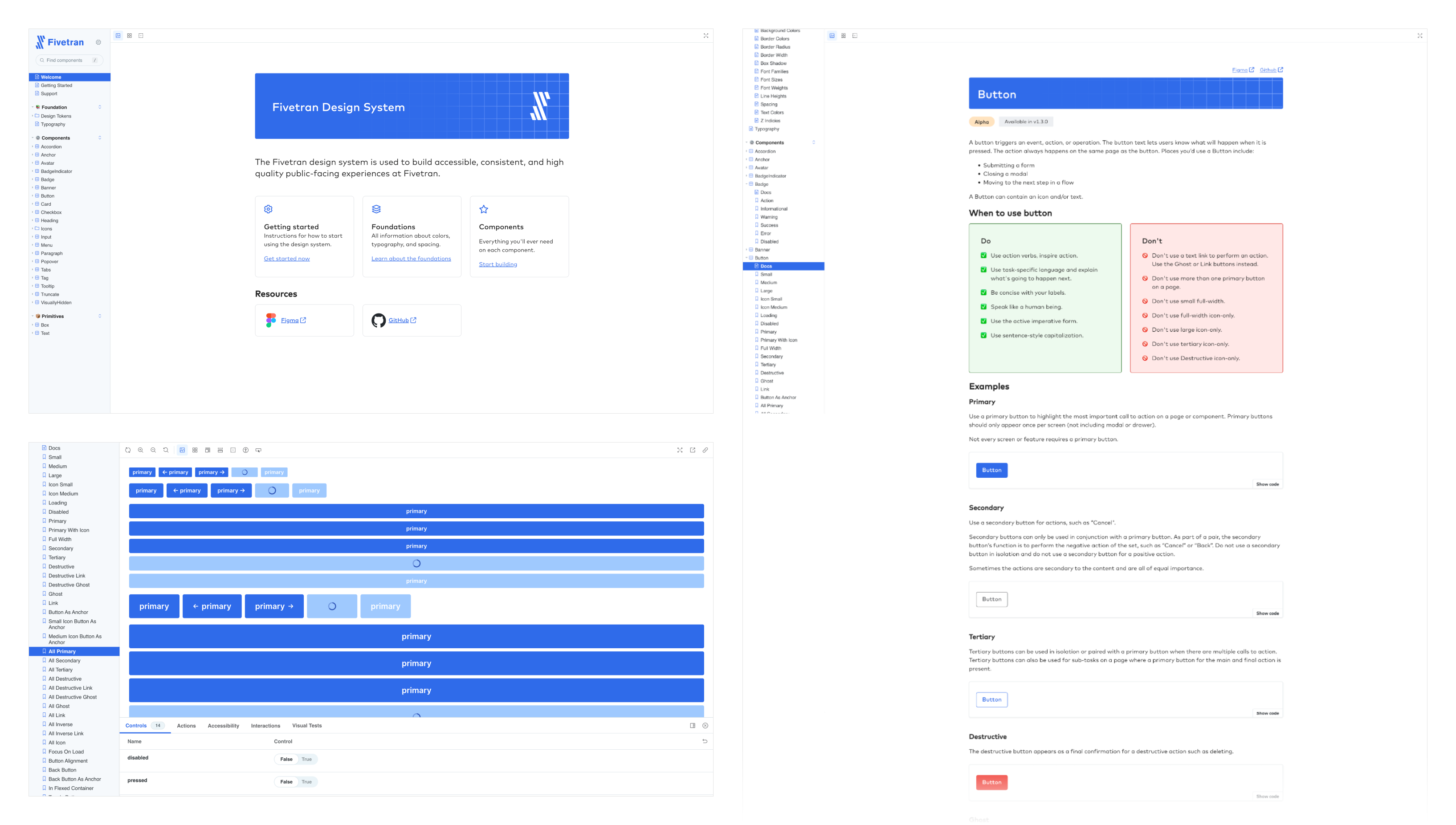
The result was a fully implemented system in both Figma and code, backed by documentation in Storybook, consistent visual patterns, and real usage across the product. Components like dropdowns, date pickers, and tables finally had a single source of truth. Teams could design and build faster with fewer bugs and better handoffs.
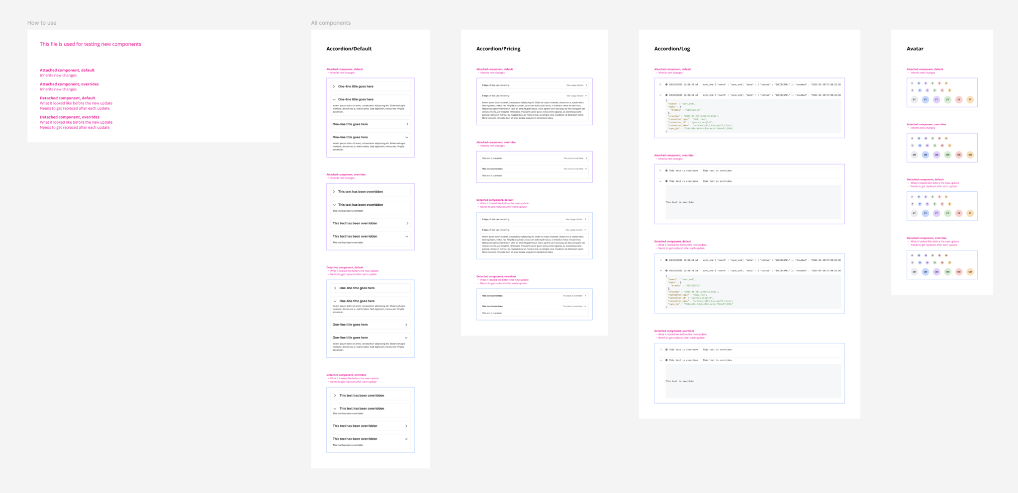
Component library
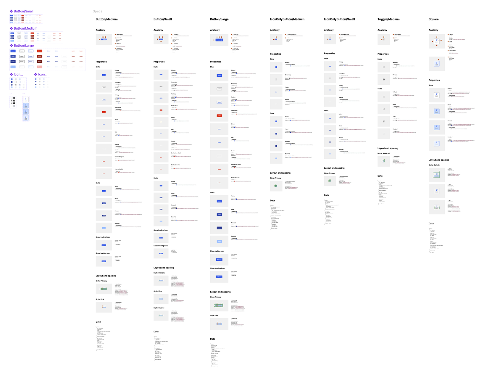
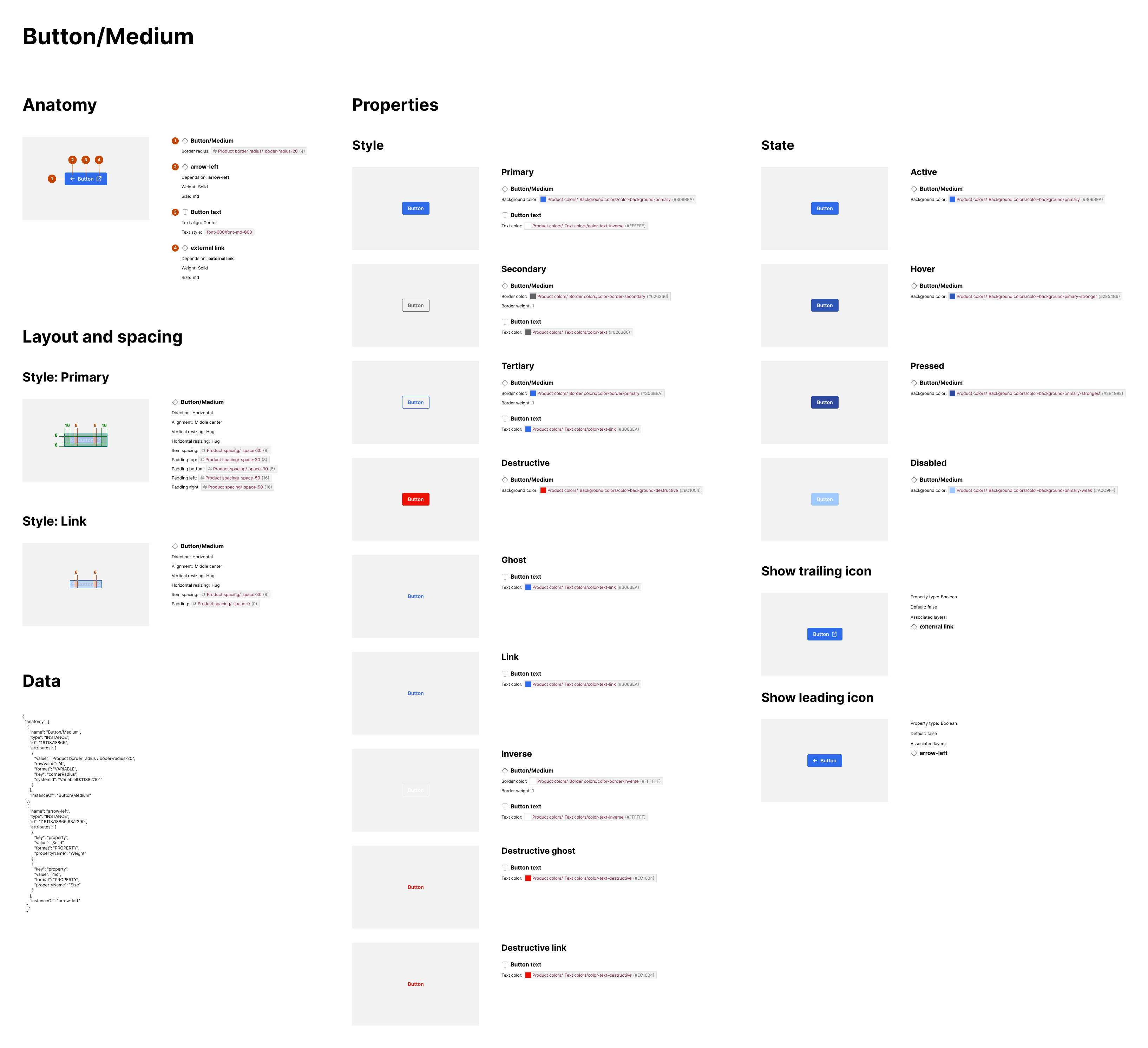
Below: the Storybook instance that can be referenced by anyone internally. This included the system overview, accessibility guidelines, and individual pages for each component outlining how to, and how not to, use them along with live examples.
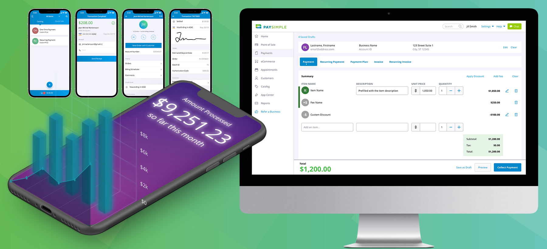
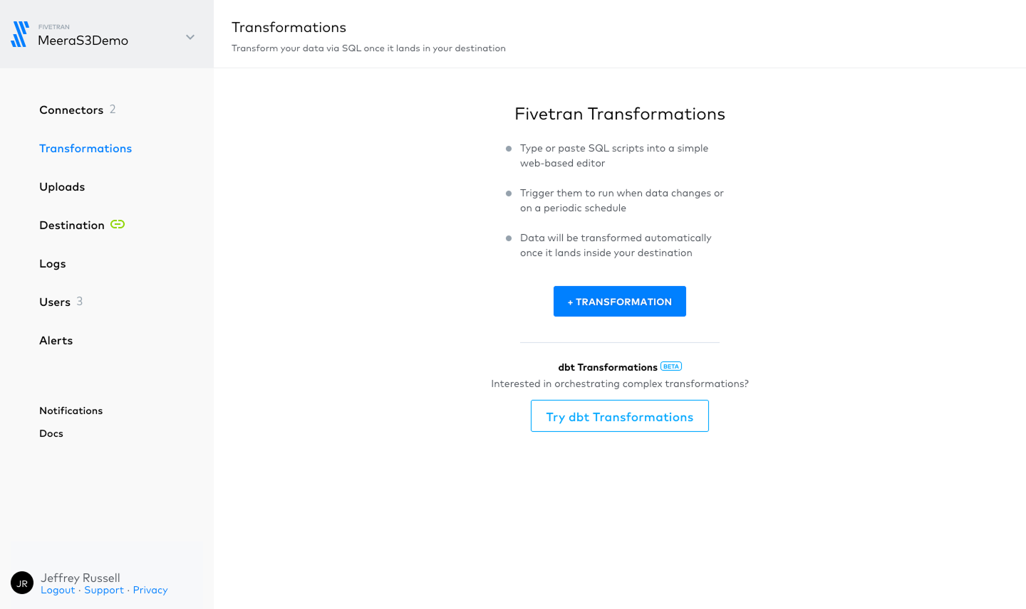
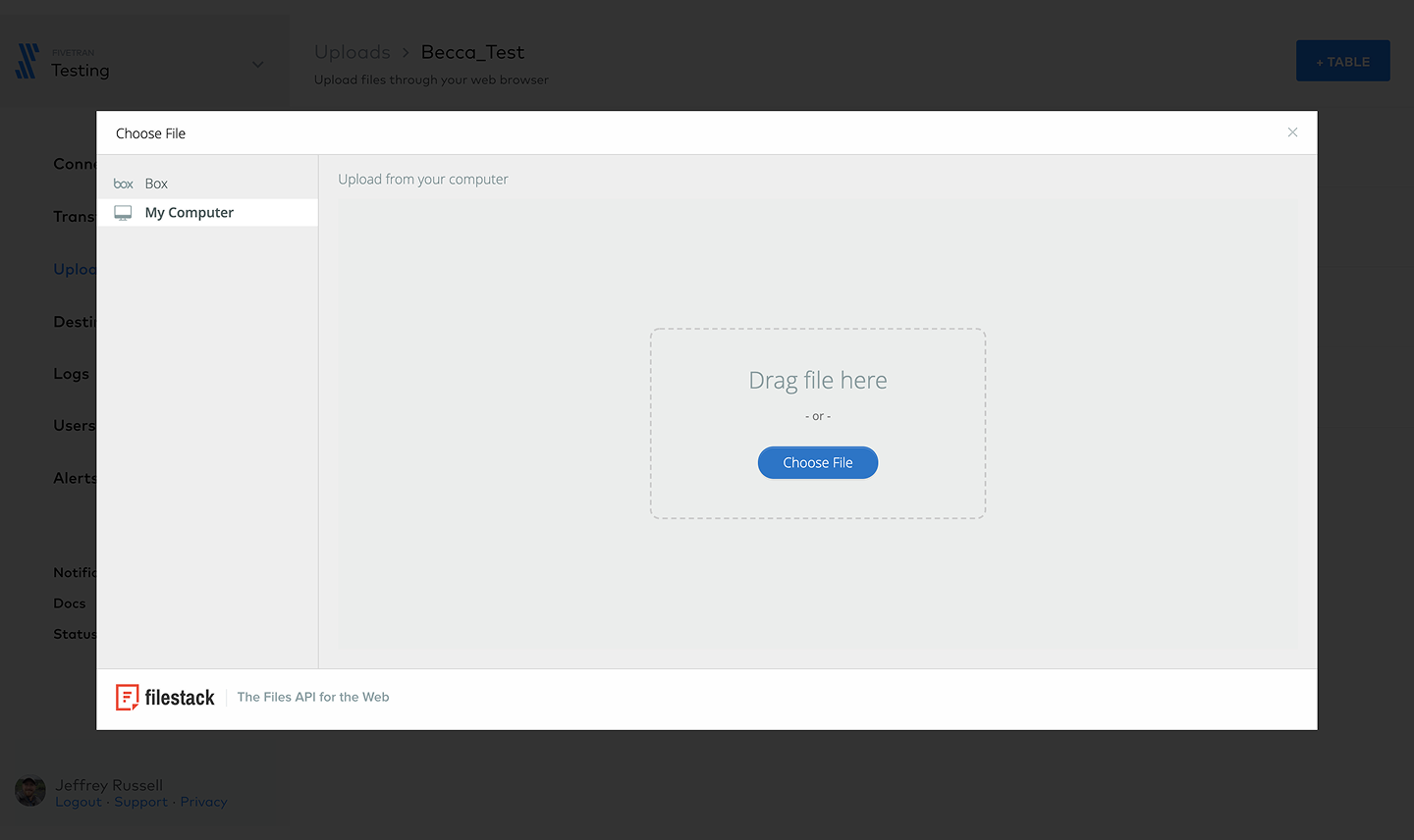
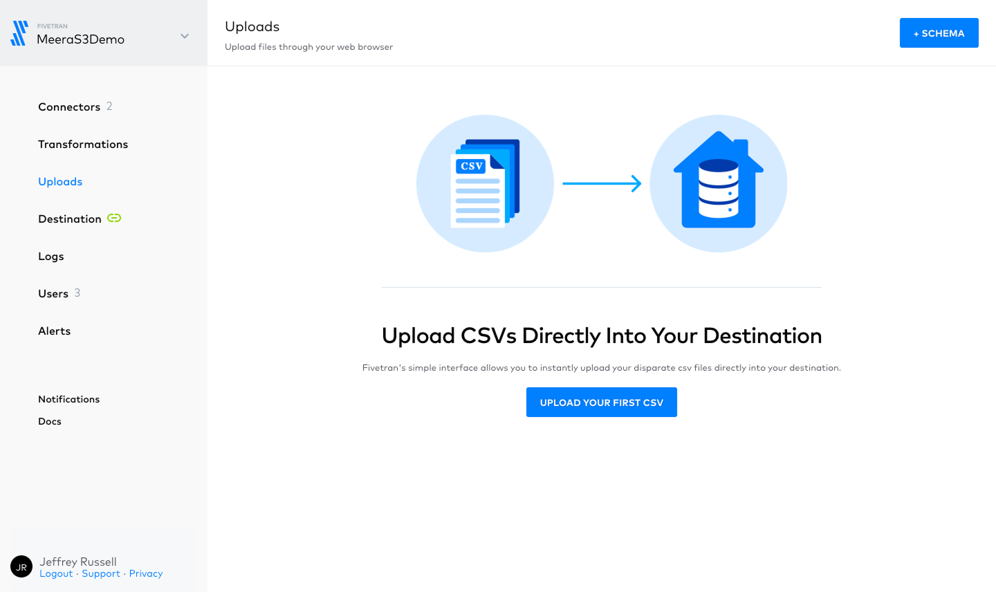
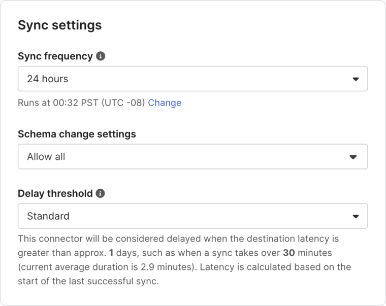
In product
Impact
The system wasn't just built, it was adopted.
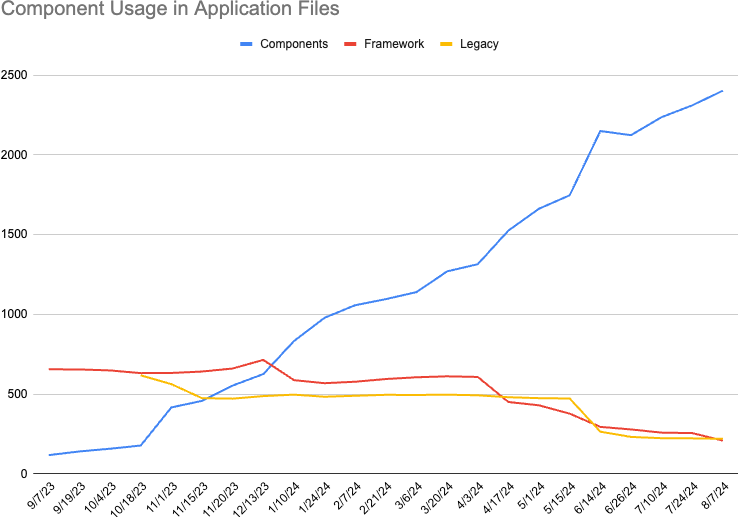
In less than a year, usage of design system components in production files grew more than 10x. Legacy elements were replaced. Fragmented styles disappeared. Product teams embraced the system because it worked, speeding up builds, improving consistency, and reducing bugs.
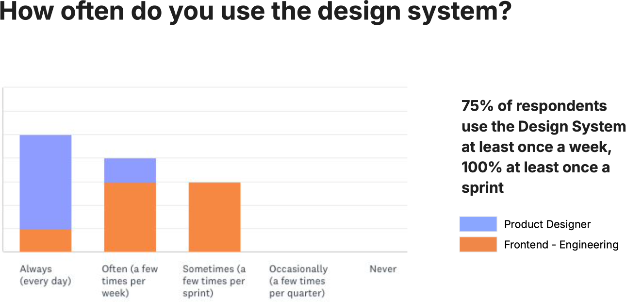
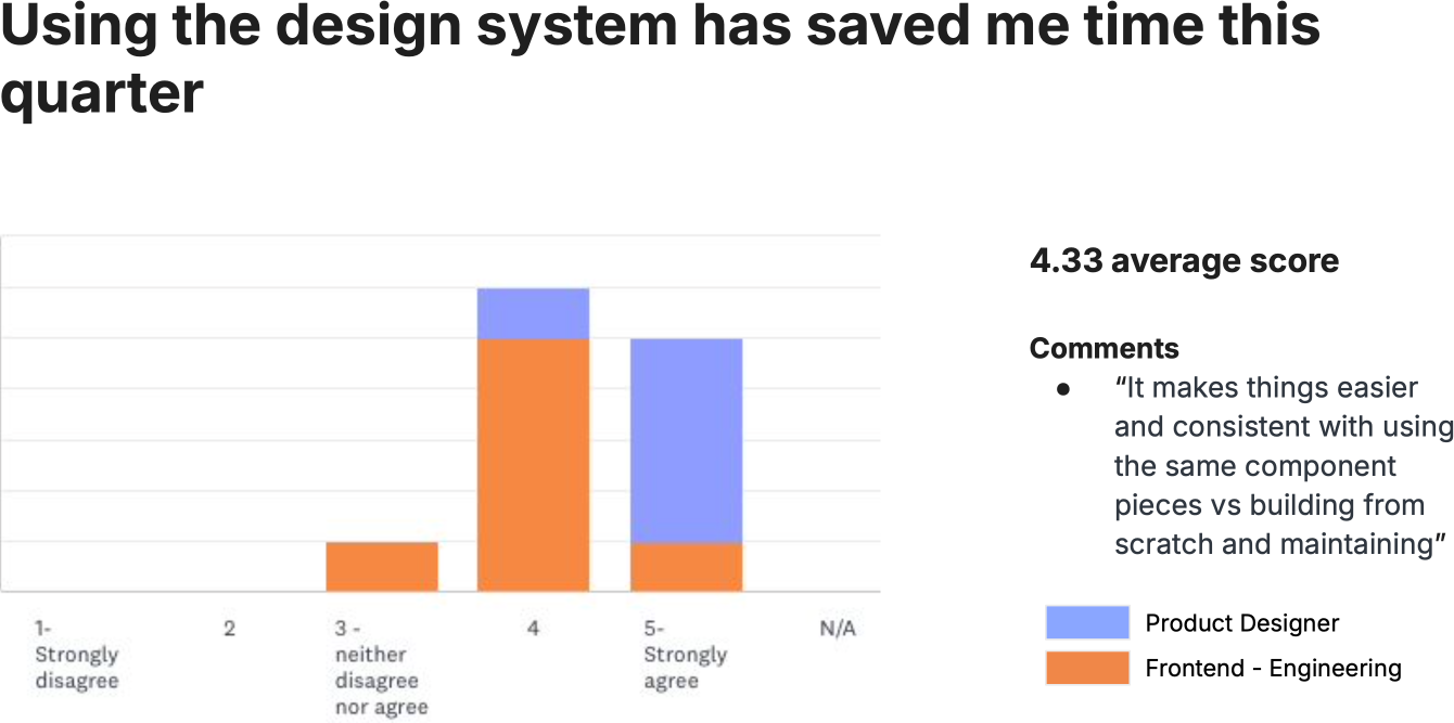
It wasn't just visual polish; it made the work faster. Designers and engineers used the system every sprint. Most used it weekly. Time savings averaged 4.33 out of 5.
The system delivered concrete results to leadership through both measurable efficiency gains and visible improvements in product quality. Stakeholders could see the consistency for themselves, helping secure continued support for the system.